OverviewGetting startedComponentsIconsGuidesExamplesBlogs
GitHub repositoryJoin the c2n-webcomponents Discord
Blogs

Building applications in the AI era · Article 01 of 7 · Published

Establish the Foundation Before Asking AI to Build a Large Application

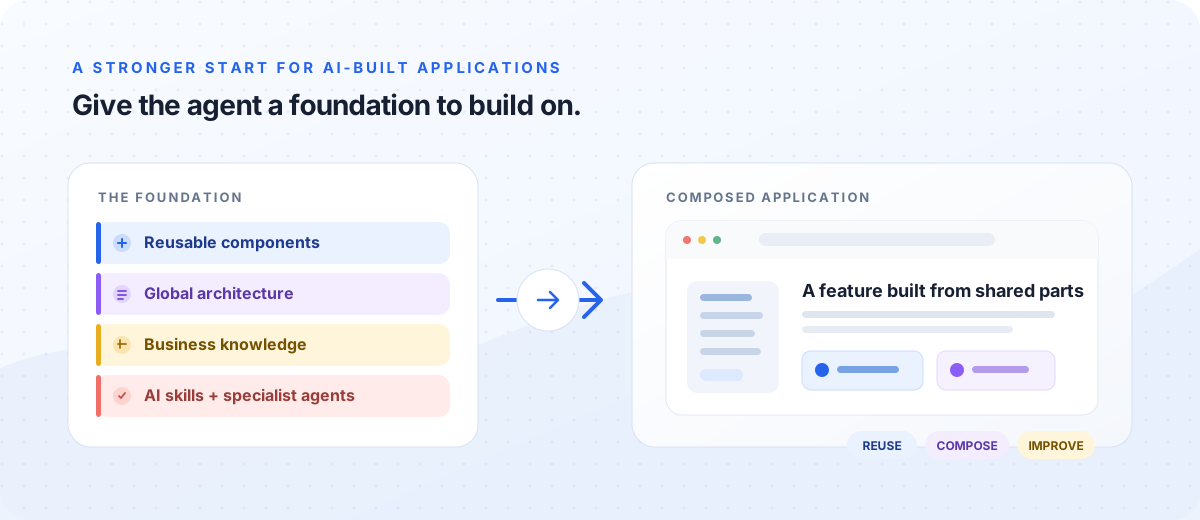
Large, complex applications need reusable components, global architecture and business context, AI skills, and specialist agents before features are composed.

Reusable components, architecture, business knowledge, AI skills, and specialist agents forming the foundation for an AI-built application.
Give the agent a foundation it can build on, then compose features from reusable parts.

You can describe an application in ordinary language, ask an AI coding agent to build it, and see a working screen minutes later. That is the appeal of vibe coding: turn an idea into something tangible, then steer it with more requests.

For a prototype or a small experiment, asking an agent to build the whole application can be a useful way to explore. For a large, complex application, it is a risky place to start. A broad prompt gives the agent room to invent the architecture, user interface patterns, component APIs, and quality process all at once. It may produce a convincing first pass, but it can also create one-off controls and inconsistent patterns that become expensive to maintain as the application grows.

The better starting point is to prepare the foundation the agent will need: a reusable component library, documentation of the application’s global architecture, explicit business knowledge, AI skills for recurring work, and specialist agents for focused review such as code quality and security. Then ask the agent to compose those building blocks into features and the larger application. AI can still work quickly, but it is working within shared context, reusable parts, and checks the team can guide and improve.

Why large applications need a foundation first

AI coding agents are good at producing a visible result from a high-level description. This makes them useful for exploring a workflow, testing an idea, or creating a proof of concept. But a large, complex application is not just a collection of screens. It is a system of shared behaviors, data, architecture, visual rules, and quality expectations.

When the agent builds every screen and control directly from a broad request, it must make many decisions without enough shared context. Similar buttons may behave differently; forms may validate inconsistently; and a pattern that should be reused may be implemented again in each feature. The code can look complete while the application lacks a reliable foundation.

That changes the first question. Instead of asking the agent to invent an entire product in one pass, ask what shared foundation it needs to build the product consistently. Prepare five connected parts:

  1. Build or improve the component library. Ask the agent to find what already exists and reuse it. Where there is a gap, define a component’s purpose, behavior, states, accessibility needs, API, and styling contract; then implement and validate it before using it across features.
  2. Document the global architecture. Explain modules, data models, ownership boundaries, APIs, integrations, and important flows so new components and features fit the whole application.
  3. Capture business knowledge. Give the agent domain terms, business rules, user roles, workflows, constraints, and exceptions. This context helps it implement what the product is meant to do, not just what a screen appears to show.
  4. Create AI skills for recurring work. Write project-specific instructions for tasks such as selecting and composing components, implementing a feature, and checking accessibility. Skills make the preferred workflow repeatable.
  5. Add specialist agents and checks. Use focused reviewers—for example, a code review agent for correctness and project fit, and a security agent for vulnerabilities and risky patterns—along with automated tests. Keep people responsible for resolving findings and accepting the result.

With that foundation in place, give the agent the approved components, architecture, business context, skills, and acceptance criteria, then ask it to deliver a bounded user flow. Use review and tests to catch issues and feed lessons back into the foundation.

These parts reinforce one another: components provide reusable product building blocks, architecture and business knowledge provide context and boundaries, and skills and specialist agents guide and check the work. This does not mean finishing a whole design system or writing exhaustive documents before learning anything. Build the foundation in useful increments: reuse what is ready, improve what is missing, and let validation reveal what needs to change.

The development cycle stays; the work shifts

Building that foundation is part of the development cycle, not a separate phase that replaces it. Teams still specify requirements, design the data and architecture, implement, and validate. AI can produce a first draft at each stage; people decide what is correct and refine the output before it becomes the next stage’s foundation.

1. Specification

TraditionalTeams write requirements and acceptance criteria for people to implement.

AI-assistedPeople give the agent goals, constraints, edge cases, and acceptance criteria; the agent can help draft and refine them.

2. Design

TraditionalArchitects and engineers define the data model, system boundaries, and key interactions.

AI-assistedAgents propose designs; people check them against the global architecture and make the decisions the agent must follow.

3. Implementation

TraditionalDevelopers build features and apply project patterns and coding practices.

AI-assistedAgents implement bounded tasks, such as a component or a feature composed from known components, using project guidance and review.

4. Validation

TraditionalTeams use POCs, MVPs, and automated or manual tests to learn and check behavior.

AI-assistedAgents create prototypes and tests; people define what must be proven and verify critical flows and results.
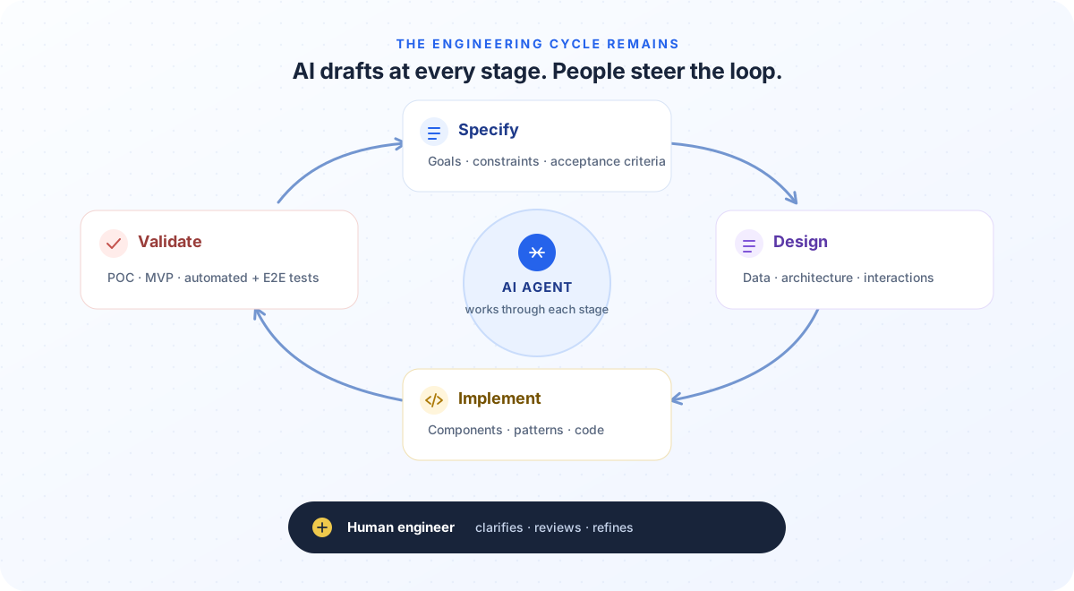
A loop moves from specification to design, implementation, and validation, then returns to specification. An AI agent works at every stage while a human engineer reviews and refines each pass.
The stages remain the same. AI drafts at every stage; the human engineer steers the loop.

A proof of concept checks whether an approach is feasible. An MVP helps a team learn whether a small product solves a real problem. End-to-end tests check whether an integrated application supports important user flows. Agents can speed up work at every stage, but people still define what success looks like and decide what to carry forward. That faster loop makes clear human direction more valuable: every specification, design, component, and test becomes input to the next agent pass.

The human 20% shapes the AI’s 80%

One useful way to picture the shift is that AI handles roughly 80% of the execution across the development cycle, while people contribute the remaining 20% that gives the work direction and quality. This is a mental model, not a measured split for every project. The smaller share can have an outsized effect on whether the application is coherent and dependable. In practice, much of that high-leverage work is preparing the five parts of the foundation and improving them as the agent works.

The developer’s primary day-to-day interlocutor is now often an AI agent. So the human role is not only to inspect a finished pull request. It is to give the agent useful context and clear boundaries before and during implementation:

  • Write specs for agents to use. State the outcome, constraints, edge cases, dependencies, and acceptance criteria in concrete terms. Keep important decisions out of scattered conversation history.
  • Define the application-wide architecture. Document modules, data models, ownership boundaries, APIs, and key flows. A feature design describes one change; the global architecture explains how changes fit together.
  • Make quality a foundation. Document the patterns and practices the agent should follow for accessibility, security, error handling, testing, and maintainability. A passing static-analysis scan is useful after code exists; it does not replace guidance that can shape the code from the beginning.
  • Set component boundaries. Explain what belongs in a reusable component, which existing building blocks to prefer, and how components should be composed. This helps the agent avoid inventing a different solution in every feature.
  • Turn repeatable work into skills and focused agents. A skill can show the agent how the team wants a component or feature built. A code review agent and a security agent can inspect a change against their areas of responsibility, with tests and human review completing the feedback loop.

The point of these decisions is to improve the agent’s next pass, not to write documents for their own sake. The spec gives it a task, architecture gives it system boundaries, business knowledge gives it domain meaning, reusable components give it dependable pieces, and skills and specialist agents help carry quality expectations through the work. For those inputs to matter, the agent must be able to find and use them at the right moment. That is where the AI-era toolchain comes in.

Tools are adapting to agent-led development

A coding agent alone is not a complete development workflow. It needs discoverable project context, structured work, reusable procedures, and feedback that reflects more than whether the code compiles. Several tools are beginning to support parts of this workflow:

Structure an agent-usable spec and plan

Examples: GitHub Spec Kit, Kiro Specs

Carry an idea through requirements, design, tasks, implementation, and review rather than relying on one large prompt.

Make project rules and workflows available

Examples: Repository instructions, Agent Skills

Give agents access to architecture, code-quality expectations, and repeatable task guidance.

Review changes and security risks

Examples: Cubic, GitHub Copilot code review, Codex Security (research preview)

Focused reviewers can check correctness, project fit, and security risks. Codex Security identifies, validates, and proposes fixes for vulnerabilities. People still judge findings and approve the result.

Create and maintain browser tests

Example: Playwright Test Agents

Help plan, generate, and repair browser tests while people define expected behavior.

These are examples, not a required shopping list, and not every team needs a separate product for every role. The important step is to establish the workflow before asking an agent to generate a large application: give it project-specific skills, and make review and security checks part of how changes are produced. Contextual code review also complements static analysis. SonarQube applies repeatable rules for bugs, maintainability issues, vulnerabilities, and security hotspots. An AI reviewer can consider change intent and project guidance. Both can provide useful signals, and people remain responsible for resolving them. The tools help carry the foundation into each task; the component library is the part the AI uses most visibly as it builds the interface.

Design systems and component libraries matter more

A design system gives an application shared visual rules. A component library turns those rules and behaviors into usable building blocks: buttons, fields, menus, dialogs, and more. Together, they give the agent reliable patterns to reuse instead of leaving it to recreate every control from scratch. This is why the component library is not just one item on the foundation checklist: it is where architecture, business needs, and design rules become concrete pieces the agent can compose.

That only works when the library has enough coverage and the agent can find and understand what is available. Missing components, unclear APIs, and thin examples push the agent toward custom code. Improving component coverage and making components easy to discover, understand, and compose are therefore part of adapting software development for AI.

For a small prototype, asking the agent to build the whole application can be the fastest way to learn. For a large, complex application, prepare the foundation—components, global architecture, business knowledge, skills, and specialist agents—then let the agent build feature by feature within it. The aim is not simply to get AI to write more code; it is to give each fast iteration a stronger starting point than the last.

The next article will focus on the practical workflow: how to ask AI to build or extend a reusable component, validate it, and compose it into a complete feature.

AccordionConnected, animated panels with shared borders and single or multiple expansion.LayoutAction BarA floating bar for the current selection: the count, the bulk actions and a button that clears it.LayoutAddress fieldA postal address input with the parts, order and labels of each country, optional autocomplete from your address provider.InputsAngle SliderA round knob to pick a direction on a full circle, or a value along an arc like a thermostat or volume dial, by drag or keys.InputsApp ShellThe frame of an application: header, navigation, main, an optional details panel, banner and footer, laid out from its own width.LayoutArea chartA line chart with the region under each line filled — every line-chart attribute, plus a fill opacity.ChartAttachmentFile and image attachments with metadata, upload progress, failure states, and actions.Data displayAudio PlayerWaveform playback for voice notes and recordings: the waveform is the seek bar, with the time, a speed toggle and an optional transcript.Data displayAudio VisualizerLive audio level as bars, a waveform or an orb: the mic meter of a call, a voice message, a voice assistant.Data displayAutocompleteSearchable combobox for local or remote items with customizable list rows.InputsAvatarImage, initials or icon for a person, with status dot and badge.Data displayBackdropA container that draws a decorative pattern behind its content: dots, a grid, stripes, flicker, aurora or meteors.LayoutBadgeTinted pill for status text, counts and dots, optionally pinned to a corner of another element.Data displayBannerA persistent, full-width message in the page flow for system notices, outages and account status.FeedbackBar chartBars over categories or time buckets, with several series drawn side by side within each band.ChartBar ListA ranked list whose rows carry their own bar: top pages, referrers, countries, or the changes between two periods.Data displayBarcodeA 1D or 2D barcode drawn as SVG in the browser: Code 128, EAN-13, EAN-8, UPC-A, Code 39 and Data Matrix.Data displayBarcode ScannerReads barcodes and QR codes with the camera: a scan window, single or continuous scanning, a beep, the camera light, and a scan event with the value and the format.InputsBeamAn animated line between two elements, for data-flow and integration diagrams.LayoutBorder BeamA decorative beam that travels around the border of any positioned container.LayoutBottom NavThe mobile tab bar: three to five destinations along the bottom of the screen, each an icon over a short label with a count or dot badge.NavigationBox plot chartThe distribution of each category as its median, quartiles, whiskers and outliers: latency per service, test scores, A/B results.ChartBreadcrumbNavigation trail of link buttons with separators, a current page and optional collapsing.NavigationBubble chartAn ECharts scatter plot with a third measure encoded as bubble area, for comparing how two measures relate while showing how much each point weighs.ChartBullet chartOne measure against a target and qualitative bands, a row per KPI, as Stephen Few drew it for scorecards.ChartButterfly chartTwo series back to back on a shared category axis, the categories named between them. The population pyramid is the classic case.ChartButtonThemeable button with slots for text, prefix, suffix and running icons.ButtonsButton GroupJoined actions and polished segmented controls with single or multiple selection.ButtonsCamera CaptureA camera viewfinder for documents, cards and faces: a framing guide, quality hints, auto-capture when steady, retake or keep, front/back switch and a list of required shots. Each photo is a Blob.InputsCandlestick chartAn ECharts OHLC chart for market sessions and other open-close ranges, with semantic positive and negative colours.ChartCardGroups related content and actions on a single bordered surface.LayoutCard InputCard number, expiry date and security code in one field, formatted as the brand prints them and checked as they are typed.InputsCarouselA swipeable slideshow with previous/next controls, indicators, looping and optional autoplay.LayoutCascaderSelect a value from related, multi-level data in one floating panel.InputsCelebrationConfetti, a burst of sparks or rising emoji for a moment worth marking, fired from code or a click.FeedbackChange ReviewReview proposed edits hunk by hunk: accept or reject each change, then take the resulting text.Editors & viewersChat InputAuto-growing message composer with keyboard submission, toolbar actions and native form support.ChatChat MessageFlexible message row for conversations, assistant answers and activity updates.ChatChat Message ListScrolling conversation log that follows new messages, counts unread ones and loads older history.ChatCheckboxNative checkbox behaviour in a quiet, themeable box with an opt-in hover layer.InputsCheckbox groupCheckboxes grouped into one form control with a value array, a group label and an at-least-one rule.InputsChipA compact pill for a filter, a choice or an entered value: selectable as a toggle, removable with a button or the keyboard.InputsChip GroupA single row of chips or badges that collapses whatever does not fit into a +N indicator, recomputed as the row or its items change size.Data displayChoice MatrixRows × columns of checkboxes or radio buttons in one form control: permissions, notification settings, agreement scales.InputsChord chartFlows between groups around a circle, where one row is one flow from a source to a target.ChartCitationA numbered inline marker that names its source, with a hover preview of the page it cites.ChatCode EditorEditable, syntax-highlighted source field on CodeMirror 6, themed entirely through CSS variables.Editors & viewersCode ViewerSyntax-highlighted code with line numbers, copy button and dark mode, powered by shiki.Editors & viewersColor AreaTwo-dimensional area for picking saturation and value of a colour.InputsColor SelectColour swatch that opens a full picker built from area and slider.InputsColor SliderHorizontal slider for choosing a hue from 0 to 360.InputsCommandA searchable list of commands: type to filter, arrows to highlight, Enter to run. The core of a ⌘K palette.NavigationComment ThreadOne conversation on a piece of content: the first comment and its replies, a reply box, edit and delete on your own comments, and Resolve.ChatComparison BarSegmented ratio bar comparing two or three quantities, such as the bid/ask balance of an order book.Data displayConfirm DialogAsks the user to confirm an action: await show() or confirm() for a true/false answer, with a destructive variant and an async confirm action.FeedbackContext MenuA menu opened by right-clicking or long-pressing an area, built from a slotted c2-menu or a render function per clicked spot.NavigationCopy ButtonButton that copies text to the clipboard — the element it sits in, another element by id, or a literal string.ButtonsCountdownTime left until a date, or through a timer, drawn as segments, a clock or a phrase, and kept current to the second.Data displayDashboardGrid of resizable panes, dragged by the edges they share.LayoutDate InputForm-associated single-date input with native picker, constraints, helper text and error states.InputsDate SelectorAccessible one- or two-month calendar for choosing a date range, one date or several dates.InputsDate StripA row of days to pick one from, a week at a time, with dots on the days that have something on them.InputsDate Time PickerForm-associated date-and-time field with a calendar and time popup, min/max/step constraints and an IANA time zone.InputsDepth chartCumulative bid and ask size around the mid price of an order book, as trading screens show market depth.ChartDescription ListRead-only label and value pairs for a detail page, in columns that wrap with the available width.Data displayDetailsCollapsible disclosure built on native details and summary.LayoutDevice FrameA browser window, phone, tablet or laptop drawn around a screenshot or live content.LayoutDiff ViewerRead-only line diff of two texts, unified or side by side, with folded unchanged lines and word highlights.Editors & viewersDistribution BarOne 100% stacked bar of a breakdown, with a legend of shares and the hovered part brought forward.Data displayDuration InputA text field for an amount of time: reads 1h 30m, 90m, 1.5h or 1:30 and stores seconds.InputsEmoji PickerA searchable grid of emoji in categories, with skin tones and the emoji used last.InputsFacet ListOne facet of a filter sidebar: an attribute’s values with counts, to include or exclude from a search.InputsFieldsetGroups related controls under a legend, with a description, a group-level error and a disabled state that reaches every control inside.InputsFile browserFolders and files with a folder tree, breadcrumbs, search, list and grid views, selection, a context menu, renaming and drag and drop.Data displayFilter BuilderA filter bar of sentence chips (Status is any of Active), an add-filter picker and an editor for each part; it reports a plain JSON filter tree.InputsFloat ButtonA floating action button for the main action of a screen, which can expand into a speed dial of related actions.ButtonsFloating PanelA window inside the page that the user drags, resizes, minimises and maximises, without blocking the page.LayoutFlowA pipeline, dependency graph or database schema on a pannable canvas: steps with a status, smooth edges, rows joined row to row, auto layout, draggable nodes saved to localStorage, a hover card and a context menu.Editors & viewersFormForm container with validation timing, an error summary, server errors, dirty tracking and async submit.InputsForm FieldLabel, hint, error, warning and character counter around any form control, wired for assistive technology.InputsFormat DateA date and time formatted for the reader's language and, optionally, a fixed time zone.Data displayFormat NumberA number formatted for its locale: currency, percent, units, compact counts and byte sizes, from Intl.NumberFormat.Data displayFX ConverterTwo linked amount and currency fields: type what you send or what arrives, with the fee, a swap and a guaranteed rate.InputsGanttA read-only project timeline: tasks, groups, milestones and dependencies on a day, week or month scale.PlanningGauge chartA focused radial KPI gauge drawn by ECharts, with a configurable scale, progress arc and pointer.ChartGoogle MapGoogle Maps with markers, a road route from A to B, and Street View, loaded once per page from a browser key.Data displayHeaderArranges brand, navigation, actions and a mobile trigger in a reusable site shell.LayoutHeatmap chartRows binned into cells by two keys, aggregated, and coloured by a sequential, diverging or stepped scale: a currency matrix, pair × tenor, hour × weekday, or a calendar of days. Drawn by ECharts, with a colour key that counts, marks and filters.ChartHighlightMarks the parts of a text that match a search query.Data displayHover CardInteractive preview card shown when a link or mention is hovered or focused, rendered in the top layer.FeedbackIcon ButtonRound, hoverable button wrapping a slotted SVG icon.ButtonsImageImage with lazy loading, a loading placeholder, an error fallback, click-to-load for untrusted URLs and a full-screen preview.Data displayImage annotatorArrows, boxes, text, numbered steps, blur and redaction over an image, exported as a PNG and as shapes.Editors & viewersImage CompareA before/after slider: two layers on top of each other, the after layer cut at a divider the reader drags.Data displayImage CropperChoose the part of an image to keep by moving and resizing a selection, then read it back as a canvas or a blob.Editors & viewersImport MapperThe mapping step of a spreadsheet import: match each column of the file to a field, check the required ones, then preview the rows with their errors.InputsIn ViewReacts when its content scrolls into view: reveal it, load more, or pause it when it leaves.LayoutIndicatorSolid dot or count pinned to an edge or corner of any element, with an accessible name for the count.Data displayInline EditText that turns into a field on click: Enter (Ctrl/⌘+Enter when multiline) commits, Escape cancels, and any control with a value that fires change can be the editor.InputsJSON FormA form generated from a JSON Schema, laid out by the schema, a UI schema or your own markup.InputsJSON ViewerBrowse a JSON value as a collapsible tree, search it, and copy any path or value.Editors & viewersKanbanBoard layout and card movement by pointer or keyboard, with cards drawn by your own renderItem.PlanningKbdKeyboard key label for shortcuts and command hints, with the semantics of the native kbd element.Data displayKey Value EditorEditable KEY=value rows for environment variables and headers: paste a .env file to split it into rows, mask secret values, and flag duplicate or malformed keys.InputsKeypadA phone-style numeric keypad that types an amount, fills PIN dots or drives another field, with a slot for a biometric key.InputsLabelCaption that names and activates the control referenced by its for attribute, with a required marker.InputsLine chartA line chart over a time or numeric x axis, drawn on canvas by uPlot, with series declared as children.ChartLink ButtonText-styled control for link and navigation actions, rendered as a real anchor or a button.NavigationListVertical list container with single or multiple selection.Data displayList ItemSelectable row with icon slots, used on its own, as the option of list and select, or as a navigation link with collapsible groups.Data displayLoading OverlayCovers a region while it loads: the content stays in place, dimmed and blocked, with a spinner and an announced label.FeedbackLog ViewerExplore large logs with variable-height virtual scrolling and sticky tabular attributes.Editors & viewersMap chartA choropleth and point map on vector outlines, drawn by ECharts: regions shaded by a value, with layers of sized points and flow lines, on the bundled world and US maps or your own GeoJSON, TopoJSON or SVG.ChartMarkdownSafe markdown renderer that streams: chat answers and READMEs, with code, math and diagrams.ChatMarkerAn inline marker that highlights, underlines, strikes through, boxes or circles a run of text.Data displayMarqueeA strip that scrolls its items in a continuous loop, for logo walls, testimonials and ticker tapes.LayoutMask InputA text input that fits what is typed to a pattern, for postcodes, IBANs, tax IDs, expiry dates and other fixed formats.InputsMasonryAutomatically pack differently sized dashboard tiles, then move or resize them in edit mode.LayoutMaster DetailA list beside the record it opens, one pane at a time with a Back step when the element is narrow.LayoutMathTeX formulas rendered as native MathML: no font CSS, readable by screen readers, safe for untrusted input.Data displayMenuCommands, links, checkboxes and submenus in a popover anchored to a trigger.NavigationMenubarDesktop-style File, Edit and View menus in one bar, with the arrow-key and hover movement of an application menu bar.NavigationMermaidMermaid text diagrams drawn in your theme colours, loaded on demand and safe for untrusted sources.Data displayMeterA measurement inside a known range — storage, quota, strength — with native meter thresholds and an optional segmented breakdown.Data displayMind MapAn idea tree laid out around a central topic, with keyboard editing as in XMind and Miro.Editors & viewersModalDialog built on the native dialog element: focus trap, backdrop, Escape, title, body and footer.FeedbackMoney InputCurrency amount field that groups digits as you type, follows the locale and stores an integer count of minor units.InputsMonth PickerPick a month, a quarter, a half-year or a year: billing periods, fiscal reports and card expiry.InputsMonth PlannerMonth calendar that draws events and trips as bars across the days they cover.PlanningNavigation MenuSite navigation bar whose triggers open panels of links below the header.NavigationNotepadA rich-text notepad that looks like paper: handwriting on ruled lines, a formatting toolbar over the selection, checklists and tear-off pages.PlanningNotification CenterAn inbox panel of notifications grouped by day, with read and unread states and mark all as read.FeedbackNumber InputForm-associated numeric input with native validation, step controls, adornments and helper states.InputsOrder BookLive bids and asks with depth bars, price grouping and a spread row, for a trading screen.Data displayOrg ChartA hierarchy drawn as connected cards that collapse and expand: an organization chart, a reporting line or a team structure.Data displayOTP InputForm-associated one-time-code field with one cell per character, paste and SMS autofill, grouping and masking.InputsOverflow ListOne row of actions or links that shows what fits and folds the rest into a "More" menu, refitting as its width changes.LayoutOverlap chartA Venn diagram of two or three sets, where each circle is a set and each shared area counts the members of exactly that combination.ChartOverlayAnchored popup built on the browser Popover API, positioned with floating-ui.FeedbackPage EditorA Notion-style editor for long text: Markdown shortcuts while you type, a / menu for blocks, a toolbar over selected text, code blocks with syntax colours and eight named colours.Editors & viewersPage HeaderThe top of a page: breadcrumb or parent link, your heading with status badges, description, metadata, page actions that fold into a menu, tabs and a toolbar.LayoutPaginationPage navigation in three layouts: numbered pages, a simple page status, or a table-footer row with rows-per-page.NavigationPan ZoomA viewport that pans and zooms its content: an image, an SVG diagram, a floor plan or a board.Editors & viewersPassword FieldA password input with a show/hide toggle, a strength meter, a requirements checklist and a Caps Lock warning.InputsPayment CardA company card face that stays masked until the reader asks, then shows each detail with a copy button.Data displayPhone InputA phone number field with a searchable country picker, as-you-type grouping and an E.164 value.InputsPie chartA pie or donut chart drawn by ECharts, where one row is one slice and label-field names it.ChartPivot tableSummarises flat rows by the fields set on rows and columns, with subtotals, totals, sorting, a heatmap and a field list.Data displayPopconfirmA small "Are you sure?" popup anchored to the button that asked for it.FeedbackProgressProgress bar or ring, indeterminate or filling to a value, with an optional label and count.FeedbackPromo Code FieldApply a promo code with checking and refusal states; applied codes stay as removable tokens with their saving.InputsPyramid chartRanked levels of a whole, stacked from a narrow apex to a wide base, where one row is one level.ChartQR CodeGenerate accessible, themeable QR codes locally as crisp SVG graphics.Data displayQuantity PickerSeveral labelled counters behind one summary ("2 adults, 1 child"), with limits per counter and in total.InputsQuery InputA key:value query field whose filters are chips you can switch off or remove, with syntax highlighting and field and value suggestions, as in Datadog, GitHub and Sentry.InputsQuestionnaireA multi-step single- and multiple-choice flow with validation, shortcuts and form submission.InputsQuick time menuA menu of quick times (Later today, Tomorrow, Next week), each showing when it falls, plus a date and time picker for anything else.InputsRadar chartCompare several profiles across the same set of normalized indicators.ChartRadial bar chartConcentric rings, each filling toward its own goal: activity rings, a readiness score, a budget per category.ChartRadioRadio options built on native inputs, grouped into one value with keyboard navigation.InputsRateAccessible star rating input with hover preview, keyboard control and optional half values.InputsReaction BarEmoji reactions with counts under a message or comment, toggled by the current user, with a picker to add more.ChatRecurrence EditorEdits how something repeats: every N days, weeks, months or years, weekdays, the third Tuesday, an end; reads and writes RRULE or cron.InputsRelative TimeTime relative to now, such as "3 minutes ago" or "in 2 days", that keeps itself current and shows the full date on hover.Data displayReorder ListReorder a vertical queue with pointer or keyboard input while the application owns persistence.Data displayRich Text EditorA compact formatted-text field for comments, replies and email bodies: bold, links, lists, quotes and code, a one-tab-stop toolbar, and a Markdown value.InputsSankey chartQuantities moving through stages, where one row is one flow and each band is as wide as what it carries.ChartSave BarA floating bar that appears while a form has unsaved changes, with Discard and Save.LayoutScatter chartAn ECharts scatter plot for finding relationships, clusters and outliers across two numeric measures.ChartSchedulerResource timeline: people, rooms or machines down the side, time across the top, each booking a bar you can drag.PlanningScroll AreaA scroll container with themed scrollbars and shadows on the edges with more content beyond them.LayoutScroll ProgressHow far the reader got: a bar that fills or a ring that closes as the page or a container scrolls.FeedbackSearch FieldA search box with a debounced search event, a clear button, a keyboard shortcut hint and recent searches.InputsSecret FieldShows an API key or other secret masked, with buttons to reveal it, copy it and ask for a new one.InputsSelectDropdown that pairs a themeable trigger with an anchored list of c2-list-item options.InputsSelection ToolbarA toolbar that appears over the text a reader selects: Ask AI, Comment, Bold, or any action the app slots in.Editors & viewersSeparatorHorizontal or vertical rule with an optional label, for dividing content and toolbars.LayoutShare SheetShare a link anywhere: copy it, send it to email or a network, scan it as a QR code, or hand it to the device’s own share sheet.FeedbackSheetDialog pinned to an edge of the screen, for content that complements the page rather than interrupting it.FeedbackShortcutKeyboard shortcuts for a whole application from one element: each binding fires an action event, runs a handler or activates a target.InputsSide NavResponsive navigation drawer beside the page: pushes the content on large screens, slides over it with a backdrop on small ones.NavigationSignature PadA box to sign in with a mouse, a pen or a finger, with undo and clear, that exports the signature as SVG or an image.InputsSkeletonPlaceholder block standing in for content that has not arrived, in three shapes and three animations.FeedbackSkip LinkA "Skip to main content" link that appears when a keyboard user tabs onto it and moves focus into the main content.NavigationSliderRange input with a themeable track, thumb, step ticks and value bubble.InputsSparklineA chromeless trend line sized for a table cell, a list row or the trend slot of a c2-stat.ChartSpinnerCircular progress indicator, indeterminate or showing a value, with optional text.FeedbackSplit ButtonA main action with a caret menu of alternatives, such as "Send ▾", or a remembered choice like a merge method.ButtonsSplit PanelTwo panels separated by a divider the user drags, or moves with the keyboard, to resize them.LayoutSpreadsheetA small editable grid with basic formulas, for budgets, quotes, price lists and score sheets.Editors & viewersStatDisplays a KPI with an optional icon, trend and supporting description.Data displayState TimelineOne band per series, coloured by the discrete state it was in over time: service health, CI runs, host power.ChartStatus LightColoured dot plus a short label for the state of something, such as Live, Building or Failed.Data displayStatus PanelCommunicate empty states, operation outcomes and recoverable errors with clear next steps.FeedbackStepsThe trace of a task as it runs, or a stepper across the top of a view: statuses, durations, stages that open while they work, and steps the reader can select.Data displayStickyPins content to the top or bottom of its scroll container and tells you when it is stuck, optionally hiding it while the reader scrolls down.LayoutStreaming TextPlain text that arrives in bursts, such as an LLM answer, revealed at a steady pace behind a caret.ChatSunburst chartA hierarchy drawn as rings, the whole at the centre and each ring splitting its parent: budgets, disk usage and org spend, with click to zoom.ChartSwipe ActionA list row that slides sideways to reveal actions behind it, as in a mail or task list on a phone.LayoutSwitchOn/off toggle on a native switch input, with label, description and thumb icons.InputsTableVirtualized data grid with declarative columns, sorting, selection, pinning and resizing.Data displayTable Of ContentsAn "On this page" navigation that lists the headings of a document, nests them by level and highlights the section being read.NavigationTabsTab strip that shows one content panel at a time.NavigationTag InputTurns typed or pasted text into removable tags — recipients, keywords, labels — with configurable delimiters, parsing and validation.InputsTerminalAn interactive prompt for commands your app answers: history, Tab completion, streaming output, Ctrl+C, ANSI colours.Editors & viewersText EffectAnimated text for a hero line or a status: rotating words, a typewriter, a scramble, a shimmer or a staggered reveal.Data displayText FieldSingle-line input with icon slots, clear button, helper and error text, and a character counter.InputsTextareaMultiline text input with resizing, helper and error text, and a character counter.InputsTheme SelectColour-theme switcher: click to step to the next mode, hover for the full menu.InputsTime InputForm-associated time-of-day input with a scroll-wheel picker, step and range constraints, helper text and error states.InputsTime Range PickerDashboard time range control: searchable quick ranges, an absolute range typed or picked on a calendar, time zone, shift and zoom, and auto-refresh.InputsTime Slot PickerPick a free time from someone's calendar: a row of days, then that day's times grouped into morning, afternoon and evening.InputsTimelineA vertical sequence of dated events on a connected rail: order history, activity feeds, changelogs.Data displayToastNotification cards and a manager for stacked, queued notifications with independent lifetimes.FeedbackTodo ListA to-do list with the feel of paper: hand-drawn ticks, notes, highlighters, swipe and drag, and a remembered look.PlanningToggletipA small ⓘ button that opens a help bubble on click or tap; the bubble can hold links and is announced to screen readers.FeedbackTooltipContextual hint shown when its target is hovered or focused, rendered in the top layer.FeedbackTourA guided product tour that spotlights one element at a time and explains it in a panel beside it.FeedbackTrace WaterfallShow the spans of a distributed trace as a tree, each with a duration bar on one shared time axis.Data displayTranscriptSpeaker-labelled, timestamped segments synced to playback: click to seek, the word playing marked, search built in.Data displayTreeHierarchical tree view with expansion, selection, checkboxes and lazy loading.Data displayTree SelectA dropdown for picking one or several rows from a hierarchy, with checkboxes, search and a form value.InputsTreemap chartA whole split into nested rectangles, each sized by its value: market maps, budgets and disk usage.ChartTruncateClamps text to a number of lines, with an optional Show more button.Data displayUploadDrag-and-drop file selection with validation, upload progress, retry, cancellation, and attachment results.InputsVideo GridLays out the tiles of a call as a grid, a spotlight or a sidebar, every tile as large as the space allows.LayoutVideo PlayerThemed controls over a real video: chapters on the seek bar, a thumbnail while scrubbing, captions, speed, picture-in-picture and full screen.Data displayVideo TileOne participant of a call: their video or avatar, with their name, a live microphone meter and status badges.Data displayView OptionsThe Display popover of a collection: layout, grouping, ordering on several levels, Show switches and visible properties, reported as one plain value.InputsVirtual ListWindowed list with built-in search, sorting, selection and an async data source.Data displayVisually HiddenText for screen readers only: kept in the accessibility tree, drawn nowhere, optionally shown while it holds focus.LayoutWaterfall chartA running total bridged by the steps that move it, where one row is one step and totals mark where the bridge lands.ChartWeek PlannerWeekly schedule with time blocks: a typical week with optional odd and even weeks, or a dated week the user edits.PlanningWheel PickeriOS-style scroll wheels to pick a time, a height, a weight or any value from a short list, by swipe, scroll, click or keys.InputsWorking IndicatorA live "work in progress" line: animated mark, shimmering label, trailing dots and elapsed time.FeedbackFeather Icons287 open-source Feather icons, one web component each.IconsMat Icon2,234 Material Icons ligatures rendered through a single element.IconsPhosphor Icons1,512 flexible icons in six weights, one web component each.IconsSymbols157 themeable spot illustrations for empty states, status panels, onboarding and error pages.IconsTask icons191 duotone icons for to-do items: work, home, health, sport, learning, food, money, travel and more.IconsThemingTheme every c2n component from a handful of design tokens with @c2n/theme, or reach for any component variable directly.GuideLanguagesComponents show their text in English; add your app’s languages as one JSON object, picked by the nearest lang.GuideFrameworksUse the components from React, Vue, Angular, Svelte, Lit or plain HTML — typed events, generated template types, and the one piece of configuration each framework needs.GuideUsing c2n in an applicationThe workflow behind every c2n app: load the theme once, use c2-* tags directly, and turn every repeated pattern into a small variant or composed component.GuideAI toolsGive Claude Code, Codex, Google Antigravity or GitHub Copilot the c2n skill, live component APIs, examples and application conventions.GuideNo components match.